Top tips to improve your membership landing page conversion
The join page is amongst the most important pages on a membership organisation’s website. Making sure it works as best as it can has real business impact and ensuring the page works visually can make a big difference.
Creative Director Luke Holderness shares some of his top tips on how to increase conversion through a few simple design techniques. From messaging hierarchy to impactful imagery - read on to hear his thoughts around showcasing a persuasive membership offering and overcoming common conversion challenges.
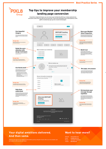
Download the infographic here (file will download direct to your computer) and read the top tips below.

Hero your Member Value Proposition
When new users visit the page, the benefits of your membership should be clear straight away. Use the most prominent area of the page to explain just that: your Member Value Proposition (MVP). To make sure your MVP is as persuasive as it can be, consider:
- Using a compelling headline that describes your Unique Selling Proposition
- Supporting the headline with a short paragraph that details what you offer, who you’re offering it to, and why it’s valuable
- Adding a powerful image that strengthens your message
- Finishing with an eye catching Call to Action (CTA)
Design tips

Our top tips for choosing a great header image:
- Try not to use stock imagery. Aim for a powerful, real image
- If using a person, try to choose one making eye contact with the viewer
- Optimise the image file to ensure loading times are as small as they can be
- Consider tying the image to the Headline by naming the person in the photo to add extra weight to the message. This technique is quite common on charity sites.
Read more in our blog 8 steps to displaying impactful digital imagery
One page, one purpose
If you are aiming to get users to join then that should be the primary focus of the page. Try to limit yourself to promoting one purpose on a given page to give it as much impact as possible. Complicated syntax or mixing key messages can dilute your MVP and distract readers.
Elements to avoid on your join page include:
- Competing call to actions like “add”, “like”, “sign up for our newsletters”, or “connect on social media”
- Common distractions that take the focus away from joining, such as latest resources, upcoming events, etc.
Design tips

If using a distinct landing page for paid traffic, consider hiding the navigation to avoid any distraction and increase your ROI.
See it in action
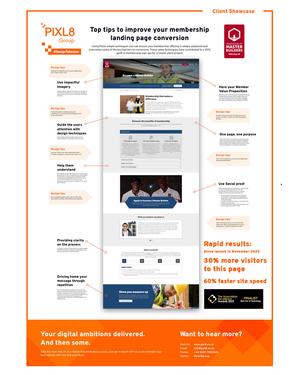
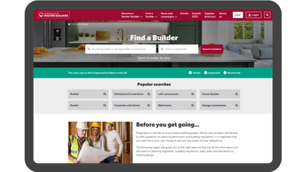
Download our free infographic showing how we optimised the Federation of Master Builder's join page on their new website to drive membership conversion.

Driving home your message through repetition
Your CTA should always be visible on screen - don’t shy away from repeating it. Emphasising it at different parts of the page is good practice, as it increases the chances of your users converting. Try to top and tail the page with your CTA as a very least, but we also encourage you to experiment with variations of your MVP messaging to see what works best.
Design tips

Consider using a persistent CTA that sticks to the screen on mobile, or follows you down the page on desktop.
Use design techniques to focus attention
“Think like a designer” is easier said than done, but with a few simple tricks you can elevate your join page and inspire your users. Here are some useful rules that can be applied to guide your users’ attention through visual cues:
- Use encapsulation to draw your users’ attention to the most important areas of your page. You can use techniques such as creating a tunnel effect or adding bold borders around the content.
- Use colour and contrasts to give your CTA standout. Complementary colours, those which oppose each other on the colour wheel, help create the greatest contrast; red–cyan, green–magenta, and blue–yellow.
- Guide your users’ attention towards a focal point - your key message or CTA - by using direction cues. This could be an arrow, the eye direction of people in your imagery or any other design treatment that includes similar visual indicators.
- The use of white space around an area of importance will allow the eye to focus on it.
Design tips

Don't be afraid of empty space on your page. Applied in the right places, it can be just as powerful as contrasting colours to draw a user’s eye to an important CTA.


Use social proof
The feeling of belonging to a community is a central theme for many membership organisations. That’s why endorsements and testimonials from your existing members are important tools to help build trust. If you are running a corporate membership scheme, a grid of customer logos can be another good way to build trust.
On your join page, you want to provide prospective members with a point of confidence that encourages them to join your organisation. Other things you can do to achieve this include:
- Use real imagery and quotes of current members.
- To add impact to a logo grid of your organisational membership, combine it with the human element of a member testimonial.
- Consider any well known members or specialists to be featured on your join page
- Consider embedding Trustpilot into your page if you’d like to showcase your positive ratings
Design tips

Our top tips for testimonials:
- Try to develop a collection of testimonials that reflect the diverse membership you have.
- Choose a member testimonial that offers insights as to what they found beneficial. This can help to sum up a membership benefit.
- Short, choice statements can have more impact that long wordy testimonials
- Video testimonials can be more powerful than written ones. Why not plan ahead and record at conferences or events throughout the year?
Help them understand
Whilst membership benefits and services are often complex and numerous, it’s best to simplify things on your join page. It’s important to provide prospective members with the information they need to make their decision, but not too much to distract them from it. To make sure your messaging is clear and concise, we suggest:
- Focus on the top 3-5 benefits
- Write in plain english, try to be succinct and distil key points
- Use videos to help explain complex ideas or reduced large volumes of text
- Use expandable panels to allow users to delve into more detail as needed, whilst keeping your page tidy
- Provide transparency around pricing and commitment, so users don’t leave the page to look for this information
- Provide inline guidance, FAQs, and tooltips to make your users feel confident in what they’re doing
- Consider offering a chat bot, where a customer can ask questions. Any enquiries can be fed back into the page, to address possible content gaps.
Design tips

Icons like ‘Checks’ can help communicate what’s included or highlight a valuable benefit within a list.

It doesn't stop there
Join pages are an important touchpoint of the member acquisition funnel. However, many of the tips we talked about in this blog post can be applied across your website as a whole, to make sure each area works as best as it can.
If you’d like support optimising your membership website design get in touch.
