Website accessibility simplified
When building a website for your members, creating a standout user experience is a top priority. A beautiful interface, creative content, intuitive structure - everything to ensure that your users enjoy their stay on your website. But it’s also crucial to consider what is takes to make sure these features are accessible for everyone.
How can a visually impaired person enjoy your great content, if your site is not properly marked up for screen readers? Or how does your intelligent information architecture support someone that needs to navigate it with a keyboard?
To answer these questions we need to consider website accessibility. Every organisation has a part to play in enabling equal access and opportunities for all, and that starts with building a website which follows best practice guidelines. Here are the essential actions your digital team can take - both in-house and by briefing your digital agency - to make your website accessible.
Who defines what best practice looks like?
The guidelines in this article are designed to outline what is required for your website to be compliant with international best practice: Level AA of The Web Content Accessibility Guidelines (WCAG). (You can read more about WCAG in our helpful glossary at the end of this post.)
The following four principles are designed to ensure your digital services remain accessible to everyone, including users with impairments or disabilities linked to vision, hearing, mobility, and thinking and understanding. Each section is divided into a handy guide for content editors and factors which you can brief your web and design agency to apply.
-
Provide text alternatives for non-text content such as images by using the alt text
-
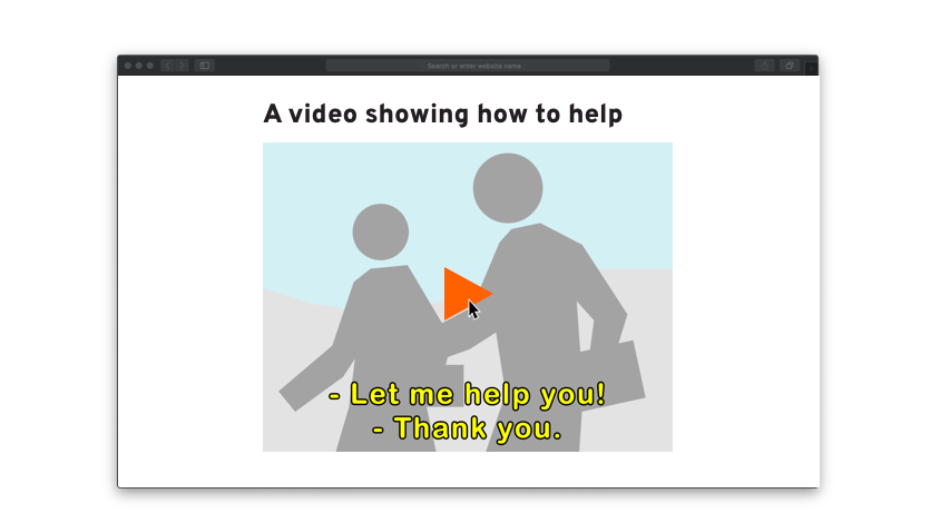
Use subtitles on videos, where appropriate
-
For video and audio, provide transcripts alongside embedded content
-
Make sure content is structured as logically as possible
-
Ensure that text size can be increased by 200%, without loss of content or functionality
-
Do not use images which contain text within them
-
Do not use colour as the only way to explain or distinguish something - a common issue for charts and keys. Almost 5% of the overall population have some form of Colour Vision Deficiency.
-
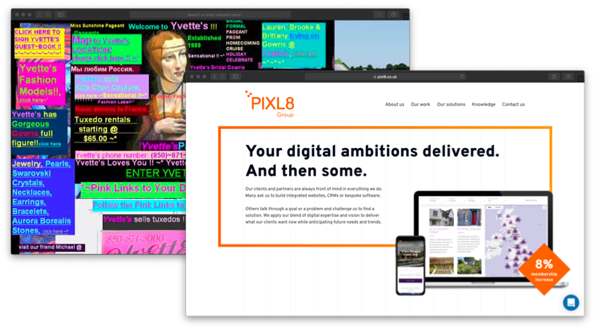
Use text colours that show up clearly against background colour. This means checking that contrast ratios are a minimum of 4.5:1 for normal text and 3:1 for larger text.
-
Use the proper markup for every feature (for example, forms and data tables), so the relationships between content are defined properly
-
Make sure your service works well with assistive technologies. For example, ensure important messages are marked-up in code so screen readers can recognise they’re important.
-
Make sure content can be navigated and read by a screen reader
-
Make sure your site adapts to a user’s device, page orientation and font size they like to use
-
Let people play, pause and stop any moving content
-
Do not use blinking or flashing content, or let the user disable animations
-
Use descriptive titles for pages and frames
-
Make sure users can move through content in a way that makes sense
-
Use descriptive links so users know where a link will take them, or what the content is from a downloadable link
-
Use meaningful headings and labels, making sure that any accessible labels match or closely resemble the label you’re using in the interface
-
Avoid automatic pop-ups, unless to provide instructions or to assist website users. For commercial intent (e.g. newsletter sign up, discount offer) use signposting which does not affect the use of the page such as inline messages.
-
Make sure everything works for keyboard-only users
-
provide a ‘skip to content’ link this does not have to be visible but is useful for screen reader users so they don't need to listen to the menu repeated on every page.
-
Make it easier for keyboard users to navigate the website by highlighting the area they have currently selected, using ‘active focus’ state
-
Only use things like mouse events or dynamic interactions (like swiping or pinching) when they’re strictly necessary - or let the user disable them and interact with the interface in a different way
-
Make it easy for users to disable and change shortcut keys
-
Use plain english and keep sentences short
-
Don’t use words and phrases that people won’t recognise - if you can’t avoid it, provide an explanation
-
Explain all abbreviations and acronyms, unless they are well known and in common use
-
Make it clear what language the content is written in, and indicate if this changes
-
Make sure all form fields have visible and meaningful labels
-
Make sure features look consistent and behave in predictable ways
-
Make it easy for people to identify and correct errors in forms
-
Make sure all form fields are marked up properly
- Ensure a default language is set for the website.
-
Use valid HTML so it can be accurately interpreted by browsers, devices and supporting software
-
Make sure your code lets assistive technologies know what every user interface component is for, what state it’s currently in and if it changes
-
Make sure important status messages or modal dialogs are marked up in a way that informs the user of their presence and purpose, and lets them interact with them using their assistive technology
-
Lets the user return to what they were doing after they’ve interacted with the status message or modal input
Get in touch for an accessibility audit assessment report.
Understanding the acronyms
W3C: The World Wide Web Consortium (W3C) is an international community where Member organisations, staff and the public work together to lead the Web to its full potential. Which includes promoting a high degree of usability for people with disabilities. Directed by Tim Berners-Lee (that’s the British guy who invented the world wide web)
WAI: The Web Accessibility Initiative (WAI) is an initiative of the W3C and develops standards and support materials to help you understand and implement accessibility.
WCAG 2.0: The Web Content Accessibility Guidelines (WCAG) are part of a series of web accessibility guidelines published by the Web Accessibility Initiative (WAI) of the World Wide Web Consortium (W3C), the main international standards organization for the Internet
WCAG 2.1: Extends Web Content Accessibility Guidelines 2.0 provides new success criteria as guidance for mobile device users by supporting interactions using touch and gestures.
Level A, AA , AAA
WCAG 2.1 guidelines are categorised into three different levels of conformance
Level A: The minimum level of conformance, the website satisfies all the Level A Success Criteria, or a conforming alternate version is provided.
Level AA: The mid-level of conformance to obtain. We recommend Level AA as the conformance for all our client applications
Level AAA: The highest and hardest level of conformance to obtain. It is not recommended that Level AAA conformance be required as a general policy for entire sites because it is not possible to satisfy all Level AAA Success Criteria for some content.
ADA: Americans with Disabilities Act. The Attorney General has publishing regulations for implementing the requirements of title II (state and local government services) and title III (public accommodations and commercial facilities) of the ADA. These regulations are codified in the Code of Federal Regulations.


