16 Aug 2021

Typography - what you need to know

Typography has come a long way from Arial, Helvetica and Times New Roman to extensive type foundries such as Typekit and Google Fonts. Now, designers, marketers and product teams are confronted with a daunting number of options when it comes to choosing a font. 

In this blog, we will give you some pointers to be able to make good font decisions. We outline why it is an important part of the design process and provide a guide for making informed decisions that will help you choose the best font options for your website. 

While most people don’t usually pick up on font choice unless there is an issue with legibility, it is an important part of the web design process that shouldn’t be glossed over. To deliver your message effectively, text and graphic elements need to go hand-in-hand to support your website’s objectives.

On average, 95% of information on the web is communicated via  written, rather than visual language. This realisation led Oliver Reichenstein, founder of iA inc., to the conclusion that ‘Web Design is 95% Typography’.1

1 - [Web Design is 95% Typography]


Use a typographic hierarchy for clarity 

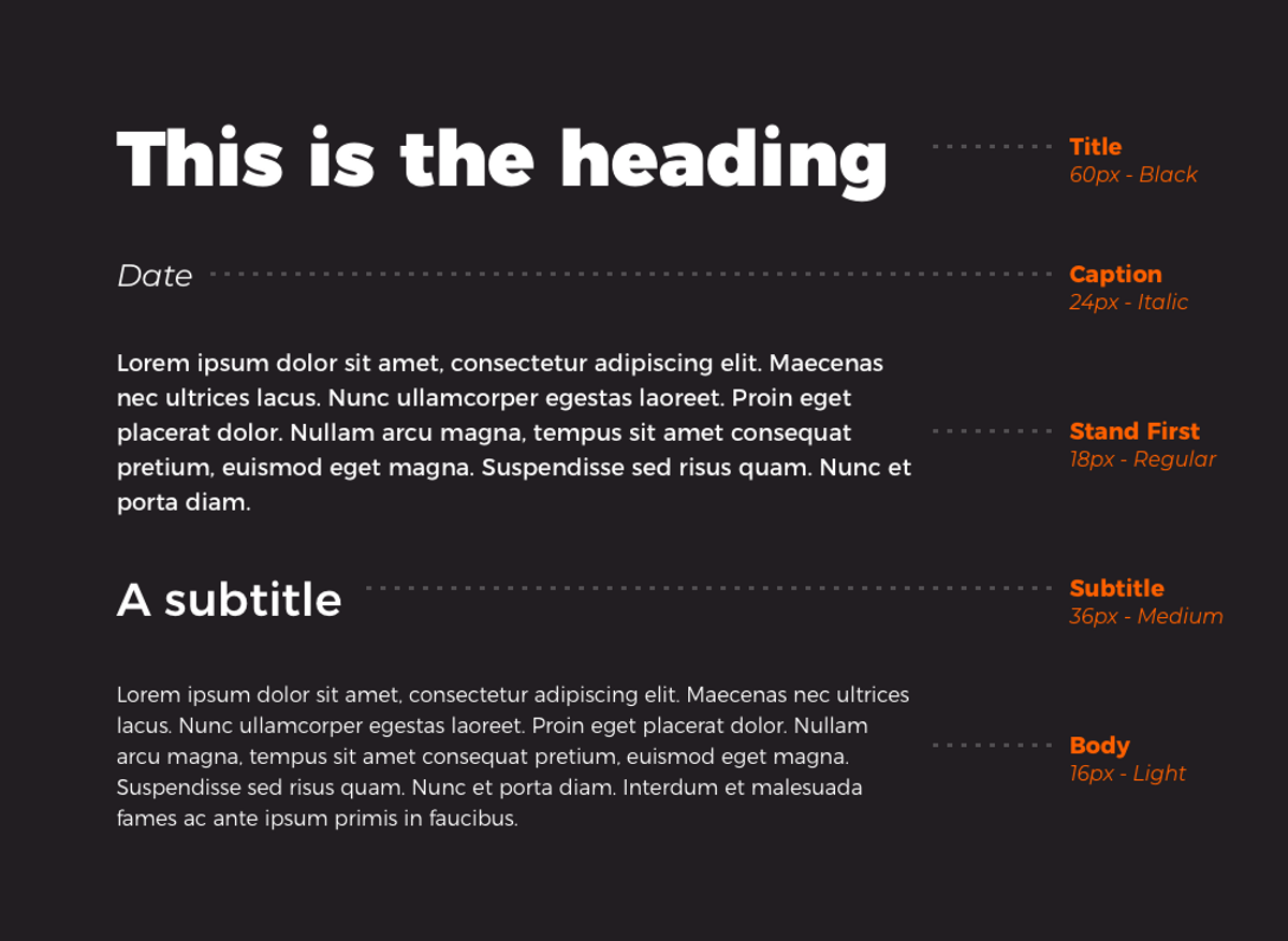
A clear typographic hierarchy that considers size, weight and contrast will help guide users through key messages on your page. You might be tempted to base your typographic hierarchy on multiple fonts, but this can make your page look busy and unstructured. As a guide, two is plenty, one is often enough.

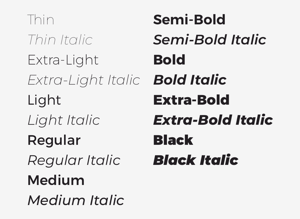
Using a font with at least 8-10 styles will give you plenty of flexibility. As a minimum, including regular, bold and italics in your font library will enable you to apply more or less visual weighting to points as appropriate throughout your body copy. 

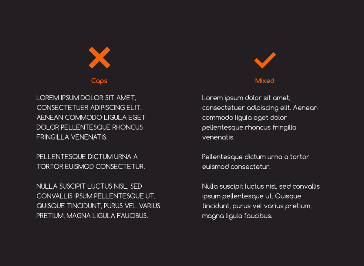
Using a bold font, rather than an uppercase font, offers a better solution for adding visual emphasis. Research suggests that when letters are all the same height, they slow down reading speed by 13-20%.2 This is because all capitals tempers the diversity of letterforms making it harder to scan large chunks of text at speed. 

2 - [Why letter casing is important to consider during design decisions]


Make reading easy on the eye

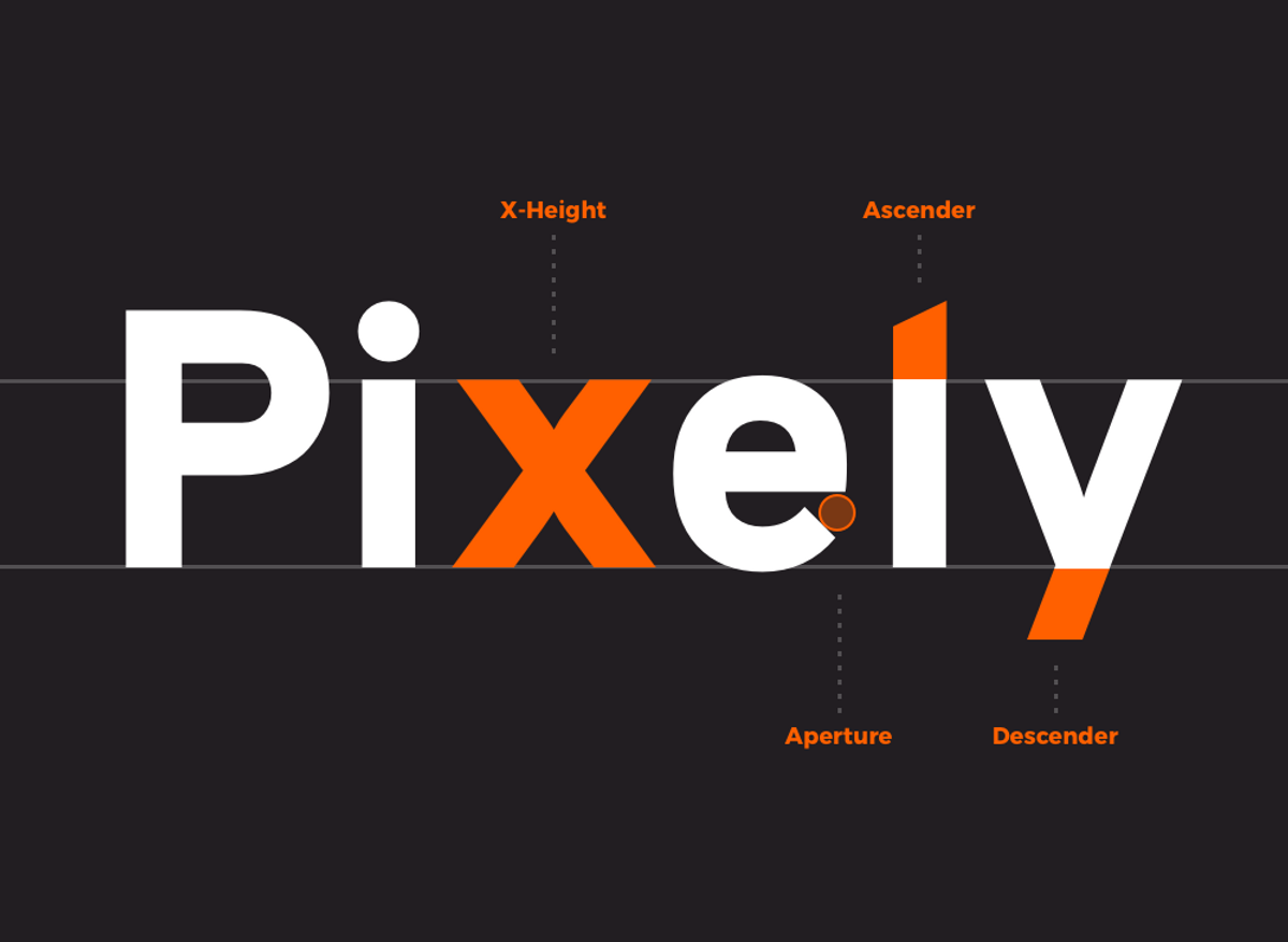
As a guide, the font you select for body copy should be unobtrusive, legible, and readable. Picking a font with these characteristics will create a comfortable reading experience. Look out for generous x-height, open apertures, and distinguishable ascenders and descenders. 

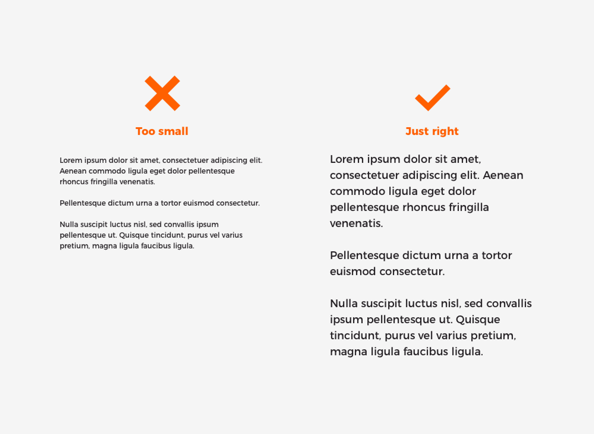
Always pick a body font size above 14px - below that, your copy becomes hard to read and can cause a real headache for users. These factors will improve the readability of your content, thus enabling you to communicate effectively with your audience.

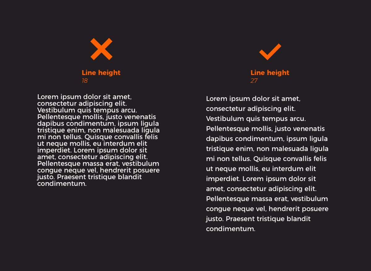
Minimising space between the lines can make it harder for the eye to track from one line to the next. Although, it should be noted that too much whitespace can also affect readability in a negative way.

Finally, make your page scannable 

Typography goes beyond font choice - it also affects alignment of text and even the length of copy. 

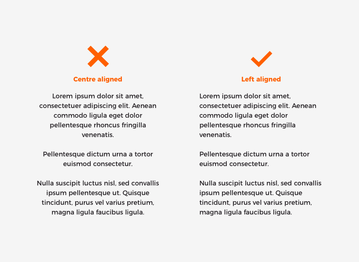
UX research has shown that we typically read in an F-shaped pattern.3 Starting in a horizontal movement, reading from left-to-right, before scrolling down the page from top-to-bottom. Therefore, justifying headings and body text to the left makes it easier for users to focus on headings and content, allowing them to take in information at-a-glance as they scroll.

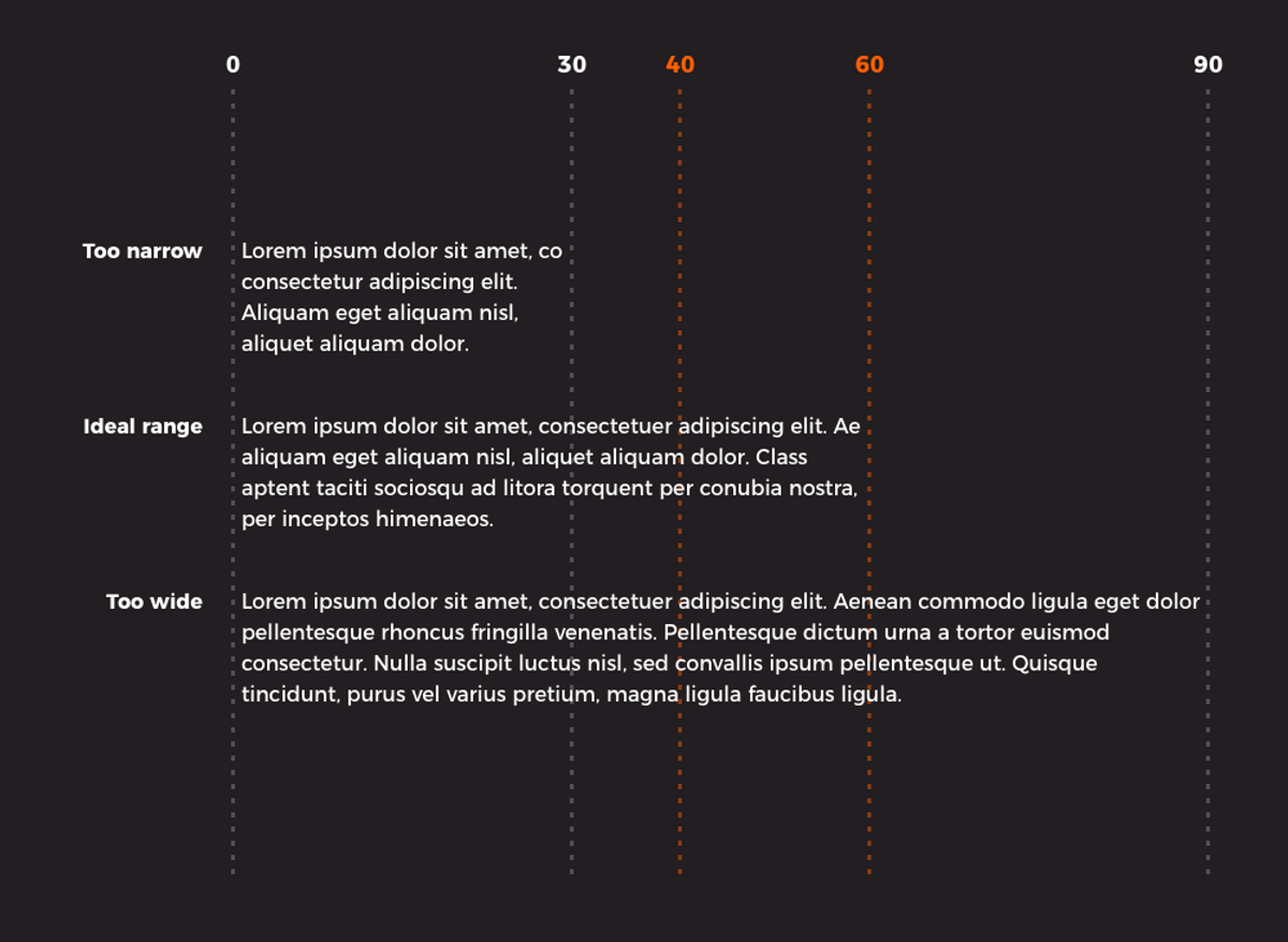
Short, punchy copy, with a line length of 40 to 60 characters, has been proven to help readers focus their attention on your message. Whereas with increasing length, attention starts to wander, risking high bounce and exit rates.

3 - [F-Shaped Pattern of Reading on the Web: Misunderstood, But Still Relevant]

Why does it matter?

Typography is about so much more than a simple aesthetic choice. Choosing the right font style, typographic hierarchy and following guidance on content layout best-practice is an essential part of user-centred website design. 

Getting it right will enable you to communicate your message effectively and support you to deliver on bigger picture website goals like increasing user engagement with content or even your conversion rate.
Want to talk typography?

If you have any questions about typography or how to enhance your creative output, get in touch.

Get in touch

Related topics