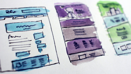
8 steps to displaying impactful digital imagery
Luke Holderness, Creative Director, Pixl8 Group
What makes a great image? It’s an important question to keep in mind as you develop your digital content.
Investing time and allocating a little budget into sourcing high-quality, on-brand imagery will support your website to drive audience engagement and deliver on digital goals.
The good news is that you don’t need to be a designer to source brilliant imagery. There are actually a few guiding principles which anyone can use to help teams develop resources and also access them easily.
So, here are our 8 steps to choosing the best images for your website.
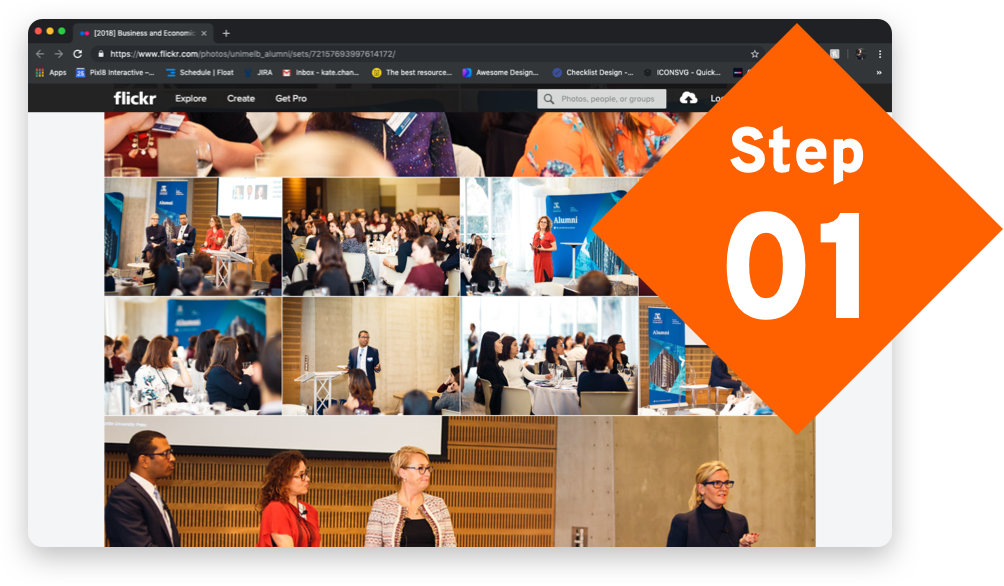
A great first step is to audit your existing imagery and create a centralised collection of branded images on a system that is accessible for your entire team. Think about all potential sources including those used previously in printed marketing materials. If you don’t have the files, reach out to your designer or photographer to get the original hi-res files.
For example, if you’re looking for an image to go at the top of a future events listing page, you could explore the following themes: 1) a past event 2) the venue, city, country where the event will be held, or 3) related to the subject of the event.
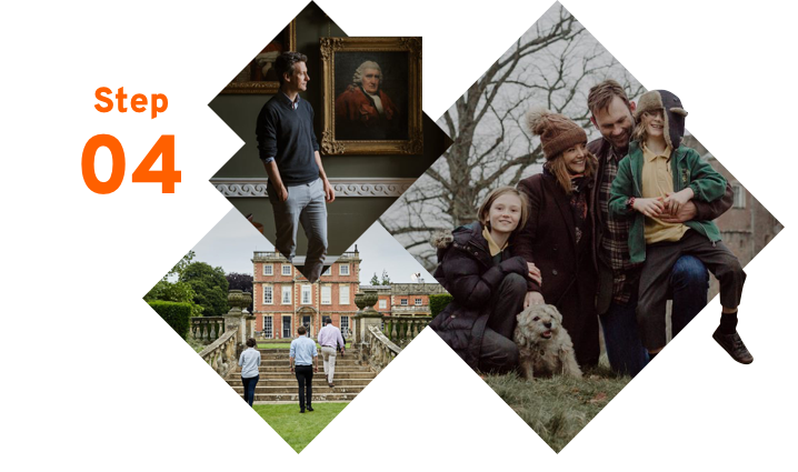
The number one rule is to always keep your audience in mind. Consider, how you want them to think and feel at a particular point in the user journey, or what action do you want them to take on a webpage? This will help you to pick more relevant imagery.
Our partner Historic Houses do a fantastic job of showing the wide geographical and architectural range of properties their members can visit. Using photography of members enjoying a great day out has proven a winning approach, driving digital engagement across current and prospective members.
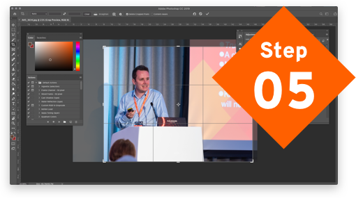
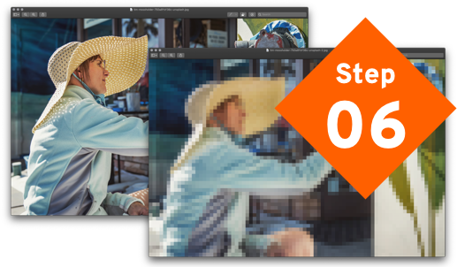
Another way to do this is by cropping your image to create some space and visualise interest. There are lots of great articles on this, but as a guide, use the rule of thirds. Frame your subject in a way the areas that are going to draw most attention and make sure they are offset from the centre.
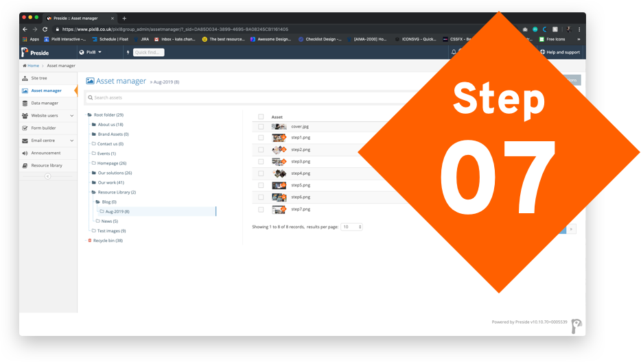
If you use our CMS product Preside, we’d recommend uploading the highest quality image available. We’ve designed the Preside asset manager to automatically resize images to the optimum size. You can also pick a focal point on an image to avoid cropping every image. If you manage lots of content, it really does save your team time.
Describe not only what you see but also consider how images can show more abstract ideas as well as metaphors such as celebrating success, overcoming challenges and demonstrating growth or diversity. Put time aside at least quarterly to review your naming classifications to make sure that the terms are still relevant.
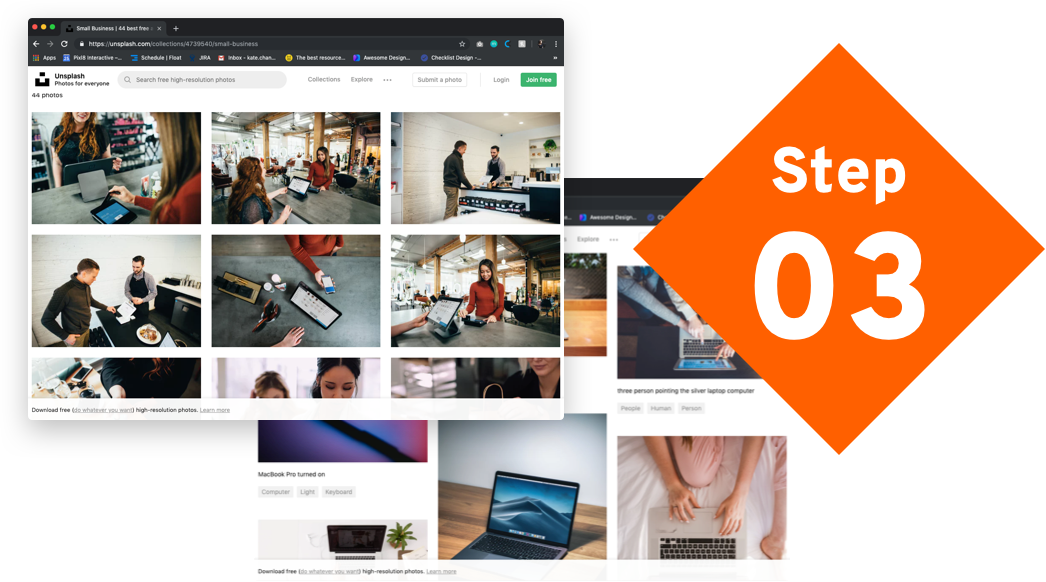
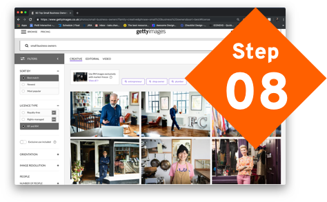
Carving out a small budget to purchase high-quality stock images from websites like istock.com or 123rf.com is an affordable way to fill in any gaps on your website. Even free websites like unsplash.com also have some great images. You don’t always need a huge budget to commission a photographer to take brand shots.
Make an impact
Image selection has such a large bearing on the look and feel of a website, but often, distributed teams on tight deadlines hastily select imagery to accompany content like an event or webpage announcements.
Planning for these situations and setting aside time to build a library in advance, to review and regularly top it up will mean your team have access to a full range of suitable and powerful imagery when they need it.
