A designer’s guide to creative
You don’t need to be a designer to understand visuals.
Creativity is a commonly used term that seems to change its meaning with the individual using it. Designers, of course, are creative. But does this mean they are the only ones that can assess a website’s visuals? Do visuals even need to be creative to be good?
There is much more to digital design than just the intuition of individuals. This is particularly true when it comes to the subjectivity of design approaches especially choice of imagery. Over the last month, we have explored these topics and have now pulled together the very core of our findings; into a practical guide to digital design, for non-designers.
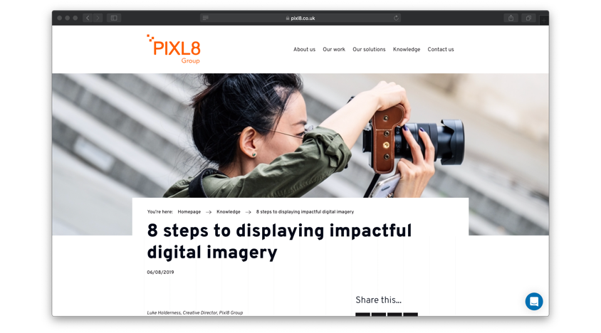
Imagery
Everyone knows a picture speaks a thousand words. How can you make sure your pictures are saying the right ones? It all starts with planning.
Before browsing through image repositories or commissioning photography, take a close look at what you already have - your organisation could be sitting on a goldmine of visual assets. Many organisations simply don’t know those assets are there, or they’re unable to locate them within a timely manner.
Think big
When it comes to choosing images, avoid those that translate your copy too literally. Try to find an overarching visual concept before you kick off your search as it will help you to come up with more original imagery.
Quality counts
There are few factors influencing the suitability of imagery for web, particularly when it comes to photography. As a rule of thumb, you want to make sure that the images you choose are high-quality and feature enough space to include copy and generally avoid making your site look too busy.
Additionally, it is helpful to know that customers tend to resonate with images that feature humans rather than objects - but always make sure you stay on-brand.
Tag to find
Finally, when you add images to your website, make sure you to tag them logically. Remember what we said about organisations being unable to find images within their own databases? Tagging will solve this problem.
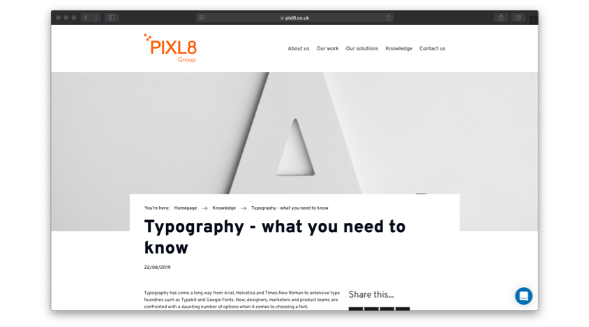
Typography
Typography is an often overlooked, but immensely impactful aspect of web design. Picking a font shouldn’t be done in haste, considering that experts like Oliver Reichenstein argue that ‘Web Design is 95% Typography’.
Limit choice
Choosing one to two fonts to reflect your brand identity in 8-10 different styles is the ideal way to avoid overloading your website with a multitude of typographic elements. This is enough to develop a clear typographic hierarchy that makes your page easily scannable for users - no uppercase needed.
Readability
Not every font is as legible as Arial. Besides font sizes, there are a number of technicalities that determine whether characters and words are ‘easy on the eye’ or not. Arguably, you need to find the right balance between a font that works for your brand and one that makes the lives of your readership as easy as possible; you don’t want their attention to drop while looking into your content.
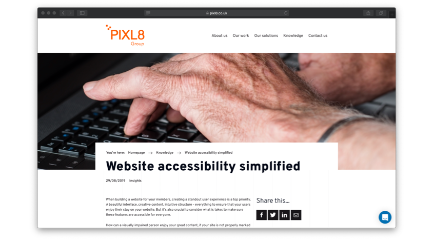
Accessibility
We often come across sites that - at first glance - offer a brilliance user experience. On closer inspection however, they are revealed to lack functionality for certain user groups.
How? These sites don’t meet accessibility standards.
Unfortunately, accessibility isn’t on the top of everyone’s agenda despite an increasing awareness of its importance.
Users first
Depending on contrast rations, markups, and scalability of your content; visually impaired audiences might find the site difficult to use. Keyboard users should be able to navigate through your site without problems, and your interface should be designed logically - making sure that assets that look like buttons are, indeed, buttons. There is nothing more frustrating than being unsure if it’s your laptop or the website that’s broken - when everything is working perfectly fine.
Simplicity
Typography, imagery and accessibility go hand-in-hand when it comes to creating a website that's easy to digest. Don’t overload pages with fancy features, as they could lead to dropping attention and high bounce rates. Identify the core of your content and display it in a simple and clear way. This will help you get your message across.
Render well
On the more technical side of things, make sure that your website is compatible with all kinds of browsers and devices that your users might use. This is particularly important as assistive technologies are advancing at a rapid speed.
Creativity is for everyone
Creative is part strategy, part experience, and expertise. There are many small changes that can make big impacts - you just need to know where to look.
There is a lot that everyone can contribute to creative challenges in digital - designer or not. Don’t just take the design of your website as a given - question it. Take another look at the practical tips we have given in this blog post and assess if they are implemented on your pages.
More input needed? Follow the link at the end of each section to get into more detail about the particular topic.
Creativity is for everyone. Let us show you how.
