Raising website design with accessibility
There is a common misconception amongst the creative community that accessibility requirements can limit design. That certain restraints reduce creativity and flatten otherwise vibrant and exciting visuals. The reality is the opposite is true. Considering the diversity of your users and designing with a more inclusive approach opens up a lot of creative opportunities, resulting in a better and more user friendly experience for all.
Understanding accessibility
Making websites and mobile apps accessible means making sure they can be used by as many people as possible. This includes those with impaired vision, motor difficulties, cognitive impairment, deafness or impaired hearing.
In the UK, at least 1 in 5 people have a long term illness, impairment or disability. Many more have a temporary disability.
Legal obligations
UK public sector bodies including some charities, have legal obligations to make their websites accessible under 2018 regulations. All companies need to comply with the Equality Act 2010 to consider ‘reasonable adjustments’ for disabled people. Across Europe regulation has increased and globally, governments have brought in more legislation on accessibility.
Underpinning these regulations are the Web Content Accessibility Guidelines (WCAG). They are a great asset when it comes to testing your website’s accessibility, but can be daunting to look at and hard to know where to begin. If you want to gain an understanding of the basics why not check out our blog post on Website accessibility simplified.
Accessibility supports growth
Applying accessibility design rules to your website is not only the right thing to do, it helps you to reach more potential members. Disabled people are valued customers and everyone benefits from websites that are easier to access and navigate.
The Web Accessibility Initiative says that;
“Businesses that integrate accessibility are more likely to be innovative, inclusive enterprises that reach more people with positive brand messaging that meets emerging global legal requirements.”
They also highlight brands that build accessibility into their business model:
Organisations that build accessibility into their ways of working not only deliver great digital services but lay foundations for future growth.
Great accessible websites
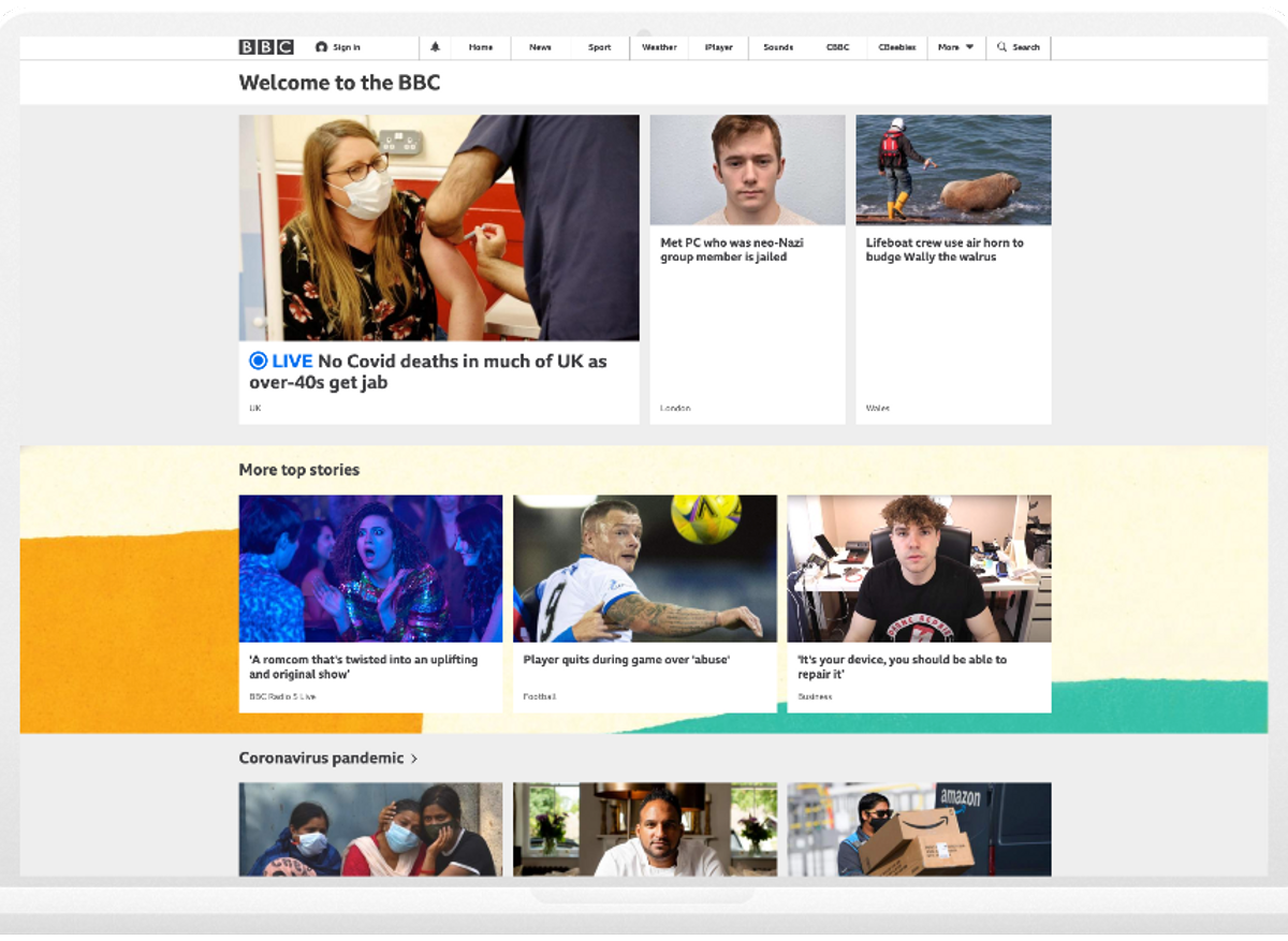
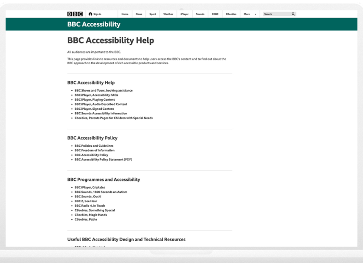
BBC - The BBC is one of the most used media organisations in the UK and they view accessibility is an ‘integral part of user experience design’. The BBC site is packed with accessibility enhancements aiming for there to be no impassable barriers to someone interacting with what they build.
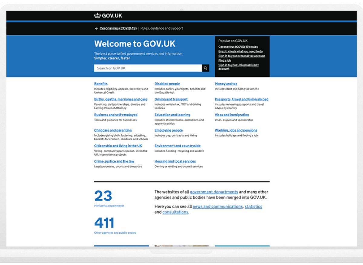
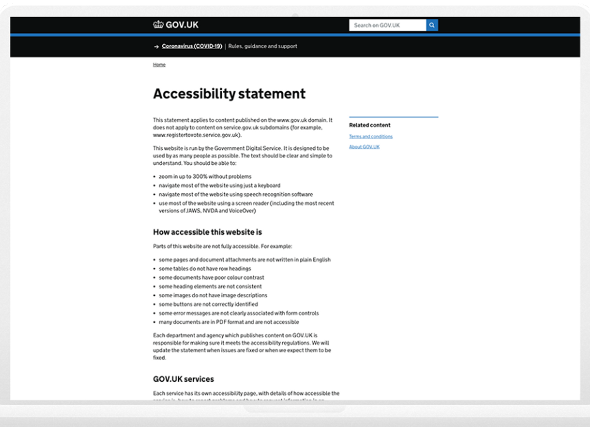
GOV.UK - Gov.uk puts inclusive design at the heart of their site. The accessibility statement and design system documentation demonstrates a real commitment to equal access informing users things have been tested and identifying any shortcomings they’ve spotted and are working to resolve.
Useful accessibility design tools

The Pixl8 design team uses a range of tools to ensure that accessibility is not just implemented but deployed to its fullest potential. Here is a selection of useful websites::
Get Stark - A handy sketch plugin that allows us to check the contrast ratio of text and colours.
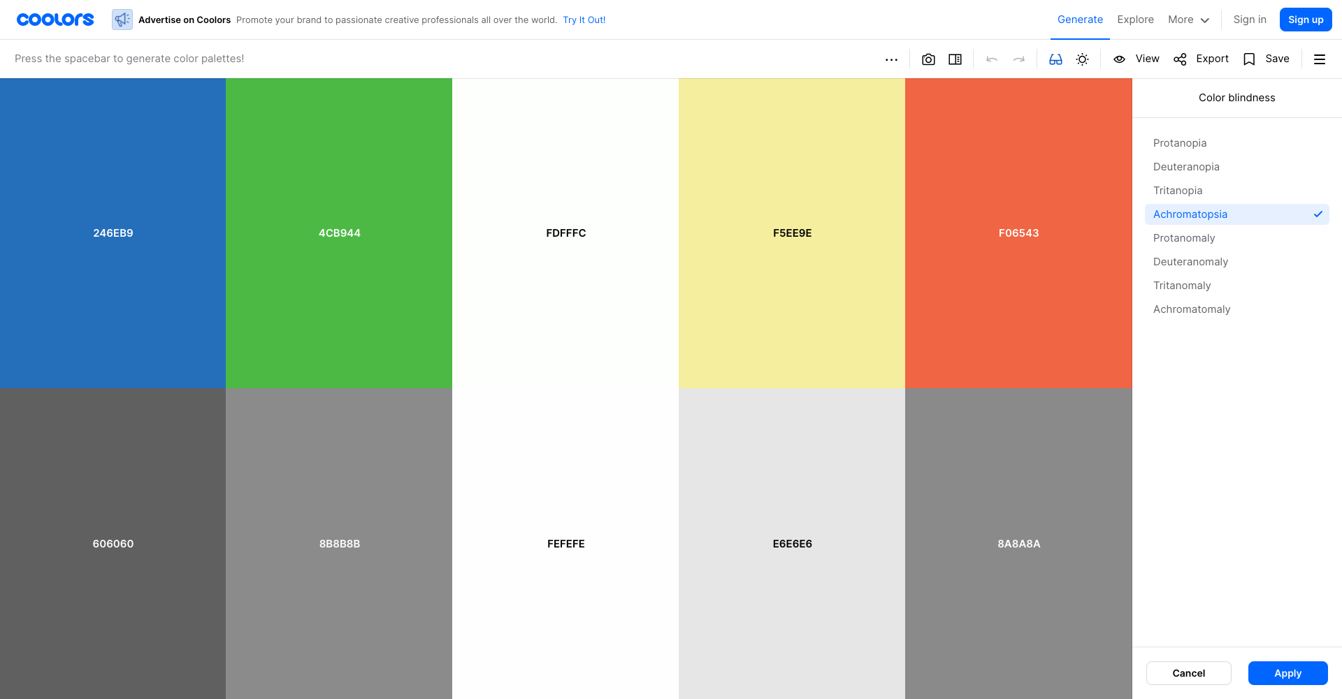
Coolors - This site offers a useful colour blindness simulator that lets us test various colour palettes.
The A11Y Project: - A great resource with lots of useful reading and open source.
Need help with accessible design?
At Pixl8 we have a deep knowledge and experience in putting accessibility design principles into practice. If you are beginning a website design project and need help assessing it’s accessibility - do get in touch. Accessibility is for everyone - empowering designers, organisations and their members.
