The laws of simplicity
Simplicity must exist with a background of complexity.
The terms ‘simplicity’ is a phrase I hear a LOT during the planning stages of our web and Intranet projects. Fair enough if it is intended to mean crisp clear content, bang on messaging, great design, superb user experience and well thought-out user journeys etc. Because to be honest, simplicity in web design is a basic courtesy in the modern world.
I was just reading an article that referenced “The Laws of Simplicity” by John Maeda. The Author explains that making a product simple may require a longer and more thoughtful design process. He goes on to say that allowing a product to embody the complexity of its design and manufacture may be faster and less expensive.
I agree with him in this respect. I guess the trouble is that too many web projects are failing to make the distinction between simple front end and simple back end. A really usable interface shouldn’t compromise functionality. It IS possible to have both.
Here are the biggest challenges I see regularly:
1. Robustness. Project leaders specify ‘simplicity’ in terms of user experience, how a web site looks and feels, but behind the scenes it’s a horror story. The build and integrations (or lack of) have been kept so simple, that it’s fragile and easily falls over
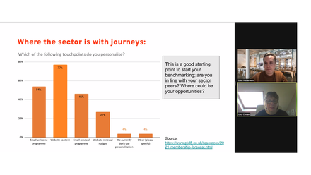
2. Lack of Ambition. Who decides what good looks like? Where does the brief come from, and is it more ‘self’ serving than fit for purpose? It can vary by business sector. In many industries the consumer drives it. In the membership sector the suppliers are driving it, which is not necessarily good because it results in a lack of ambition. Too many organisations are settling for “OK” and failing to see the huge business opportunity.
It’s an uncomfortable truth, but perhaps some web projects are ‘wound back’ a little because the project owner lacks confidence in their own ability to create and manage something complex at the back end. It’s just easier to ‘keep it simple’
3. Forgetting User Needs. Ahhhhh. My favourite topic again! It’s a VERY easy trap to fall into – specifying and creating a web site that works for you, rather than leading with your users’ needs. Don’t do it. Please. Just stop.
I think the answer here is errr…. Simple. Firstly, do your research. Go to the market, check out what’s hot, what’s possible, what your web users want and what they don’t realise they want. Analyse.
Secondly, brainstorm. Get yourself in front of a great web partner and think big. Have conversations with experts that are strong in both front end design and back end functionality. Doing your due diligence here will fill you with confidence and excitement about creating a simple ‘looking’ web site that has enormous functionality.


