Get in touch
Talk to us about your digital ideas and see how we can help
Taking a user-first approach to content structure design to improve service quality and audience satisfaction.
The UK’s advertising industry ranks among the world’s top five largest advertising markets. And with that comes the ever increasing number of adverts we’re served on a daily basis. For the Advertising Standards Authority (ASA) – the independent regulator of advertising in the UK – their remit will only continue to grow.
The ASA are responsible for monitoring adverts across all channels, from print to TV and digital, to ensure content complies with industry rules. One of their main functions is to handle complaints from the public and industry too. While their sister organisation, the Committees of Advertising Practice (CAP), also provides guidance on and writes rules for the advertising industry.
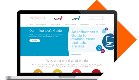
ASA wanted to create a single website which brought together their two sister companies. Improving both the user experience and the accuracy and quality of their data was priority.
This was a complex project with three distinct challenges. Firstly, the ASA wanted to find a way to visually represent the two sister brands within one fully-responsive website. Secondly, improving the service they provide to both public and industry audiences demanded the development of a user-friendly content taxonomy, bringing together content from both sites. And finally, the ASA wanted deeper systems integration to improve the quality of their user data and reporting.

It is now simple for ASA users to find the information they need within one co-branded site. We took user research findings to develop a uniform content taxonomy that housed all content types and categories – from both sites – to deliver a smooth user experience.


Managing the migration of ASA's extensive resource library to the new website was critical to save the team time and money. Our web developers applied the new content tagging structure to the entire content back catalogue to automate the content migration process.
"User research showed that the websites weren’t offering what people wanted and needed, especially considering how important the sites are to what we do. 98% of advertising complaints come through the site and that’s the main part of our business".
Jonathan Mclellan, Advertising Standards Authority
Previously, system integration had caused issues for ASA. If one system had a problem, their website was also affected, posing problems for their service users. We delivered a fully-integrated website, linking four systems with the new website – Microsoft Dynamics CRM, SharePoint, Sage Pay and a bespoke complaints database.


The new website was built using Preside CMS, our flagship content management system. The combination of an intuitive, easy-to-use CMS and training in how to use the system, means the ASA team now feel confident to update and manage website content. All content changes are now made universally across a single site which has freed up more time within the team to focus on other projects.
The main thing that has stood out for me is Pixl8’s proactiveness, willingness and flexibility. Their technical experience together with their design experience makes them pretty unique.
Jonathan Mclellan,
Advertising Standards Authority

One of the country's leading membership organisations, The Federation of Small Businesses, celebrates the success of businesses through awards. See how we developed a dynamic awards management system for the FSB's events.

Why choose Pixl8? You can draw on our experience of delivering a wide range of digital projects for over 200 membership organisations.